
Note
Some screens and details have been altered or omitted to protect IP and business knowledge. This portfolio focuses holistically on key problems and decisions, showcasing my design thinking rather than revealing the full scope of apps and systems.
Note
I'm unable to publicly share large portions of this project, but I can provide more detail one-on-one. Please feel free to contact me for more information.
Tools
Balsamiq Mockups -> Figma -> Zeplin
Lucidchart -> Figjam
ClickUp
Team
1 Product Designer - Me!
8 Developers
1 Product Manager
Discover
Exploratory Research
Stakeholder Interviews
Assumption Mapping
The Client
Next Level Urgent Care is a Texas based urgent care network. Next Level provides high-quality, cost-effective medical care for all who need immediate attention for non-life-threatening illnesses and injuries.
Discovery Process
I kicked off the discovery process by reviewing all the relevant documents and meeting with NLUC's executives, medical officers, and other key stakeholders to understand the current system's pain points.
I analyzed both quantitative and qualitative data from the old system. I looked into usage patterns, error rates, and the reasons behind insurance claim rejections. Through interviews and focus groups with medical staff, billing departments, and administrators, I gathered insights into their daily challenges and what they hoped to see improved. I analyzed the feedback to identify critical areas for improvement. This helped me grasp the inefficiencies, coding errors, and consistency issues in patient care within the existing system.
Define
Problem Framing
Defining Strategy
Measures of Success
Feature Mapping
User Flows
Defining The Problem
In this phase, I used the insights from my initial research and discussions with executives and medical officers to define the project's scope and objectives. I outlined the key problems, such as missed charges, coding difficulties, and inefficiencies in handling multiple diagnoses. By synthesizing stakeholder feedback and my findings, I developed a set of user and system requirements aimed at addressing these challenges.
Key Problems
Missed Charges and Coding Challenges: The old system made it difficult to link codes to diagnoses accurately, leading to missed charges. Incorrect links often resulted in improperly coded charges that were subsequently denied by insurance companies.
Consistency of Care: There was a significant desire to enhance the consistency of care across different patients, ensuring that everyone received the same level of quality and treatment regardless of the provider or location.
Reduction of Errors: The old system was prone to errors, such as incorrect vitals and reviews of systems, contributing to potential risks in patient care.
Inefficiency and User Interface Issues: The system was cumbersome, requiring numerous clicks to complete actions and manage multiple diagnoses in a single visit. This inefficiency, combined with the need for excessive scrolling, made the system less user-friendly and time-consuming.
Need for Improved Efficiency: A more efficient interface was needed to reduce scrolling and clicks, aiming to streamline operations and enable providers to see more patients per hour, thereby decreasing costs and improving margins.
Varied Care Tiers for Employer Agreements: NLUC's service to large companies with varying care tiers based on employer agreements was poorly supported. The old system lacked an efficient way to manage different employer coverages without extensive manual effort.
Financial Classes and Coding Methodologies: The system did not effectively handle different financial classes such as commercial insurance, Medicare, work comp, PRIME membership, and Medicaid, each with its own coding methodologies. This limitation made it challenging to apply the correct options and restrictions.
Design
Information Architecture
Low-fidelity Screens
High-fidelity Screens
Design Process
With a clear set of requirements in hand, I moved on to the design phase, where I focused on creating wireframes and prototypes. My goal was to develop a user interface that simplified the documentation process, improved navigation, and reduced errors. Each design iteration was based on feedback from the Define phase, ensuring the solutions were user-centric and met NLUC's needs.
Technical Design Snag
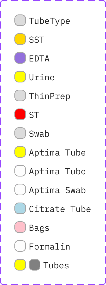
In the design phase, we hit a major snag: the need for a quickly deployable MVP meant we couldn't develop a management front-end in time. This front-end was crucial for allowing clients to adjust a wide range of elements, such as medications, templates, and tests.
The workaround? I worked with the development team in deciding to use YAML, a human-readable configuration format. This didn't require a management frontend but still let clients make changes easily. It was a practical choice that also made it simpler for our developers to define specific YAML fields, like tube type and container color for collections that were critical parts of my design. This decision was key in getting our MVP out on time without sacrificing functionality or user control.
Testing
Usability Testing
Usability Testing
For testing, I worked directly with NLUC's clinical staff, including medical assistants and physicians, to conduct usability tests. This hands-on approach with end users allowed me to gather specific feedback on the design's effectiveness, leading to several iterations to refine and improve the system.
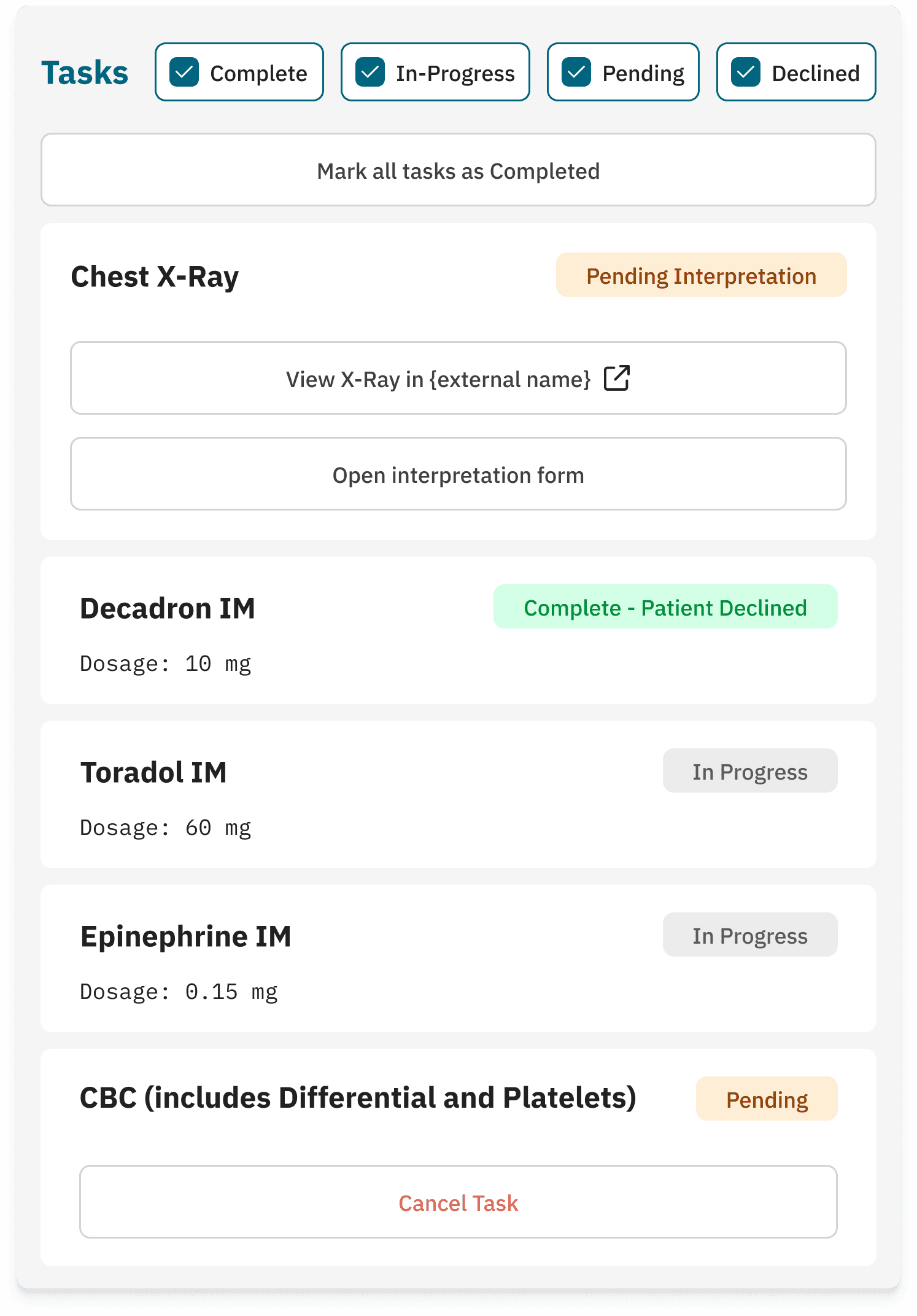
Pain point: External Tracking Board
During usability testing, I observed a significant bottleneck in the workflow, particularly when medical assistants and physicians administered medications or ordered in-house tests like CBC tests. The process was hampered by the use of an external tracking board for managing these tasks, which introduced its own set of challenges. Recognizing this inefficiency, I included this finding in my feedback reports to both the client and our development team. To address this issue, I proposed integrating the tasking system directly into the clinical note builder. This solution aimed to streamline the workflow by eliminating the dependency on an external system for these critical tasks, thereby allowing medical assistants and providers to complete their tasks more seamlessly within one platform and saving valuable time.
Deliver
The Result
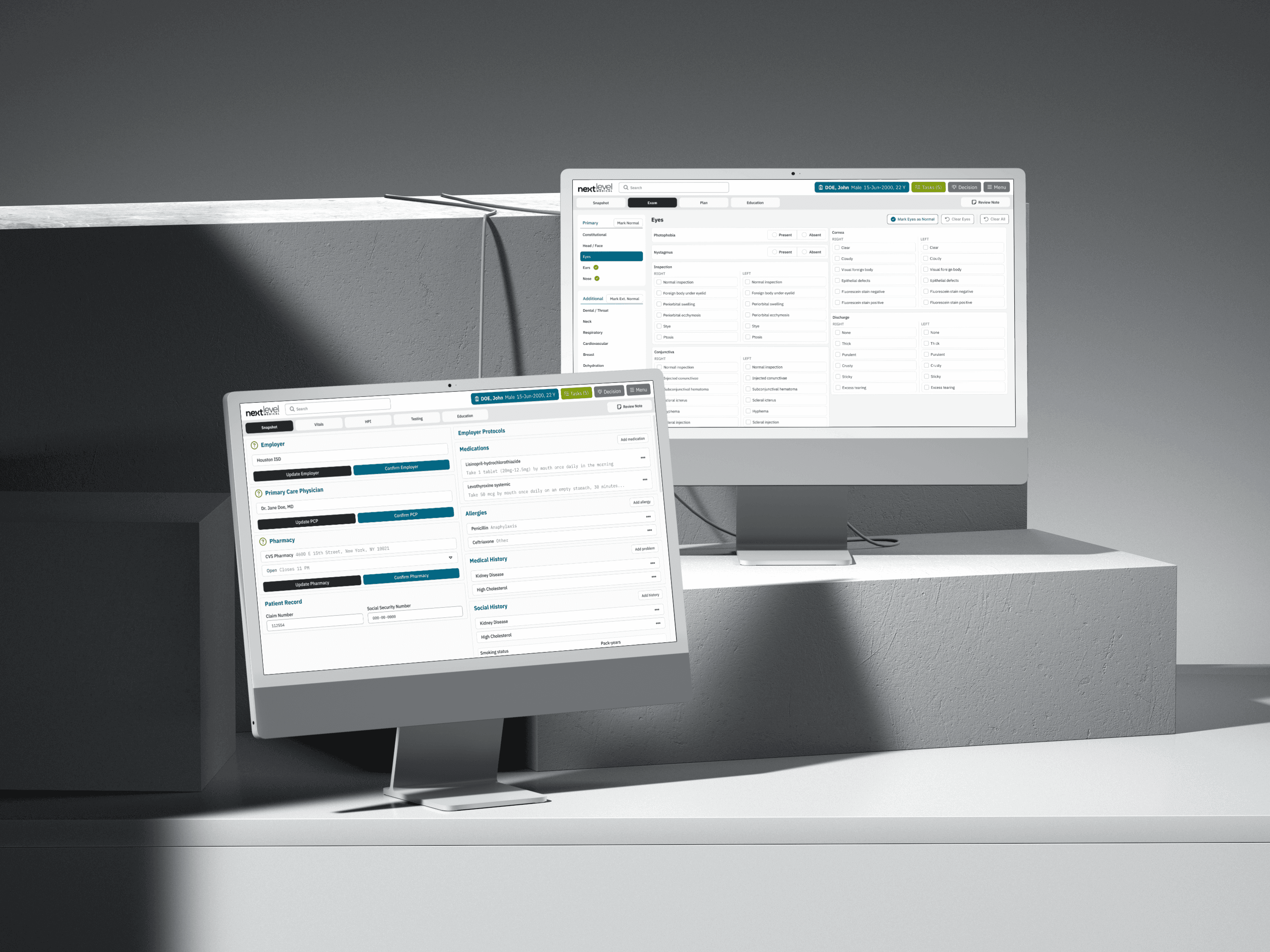
In the Deliver phase, I finalized the design and worked closely with developers to bring EzDocs to life. This involved handing over detailed specs and ensuring the implementation matched our vision. The result was a system that addressed our initial goals and significantly improved the clinical note creation process at NLUC.
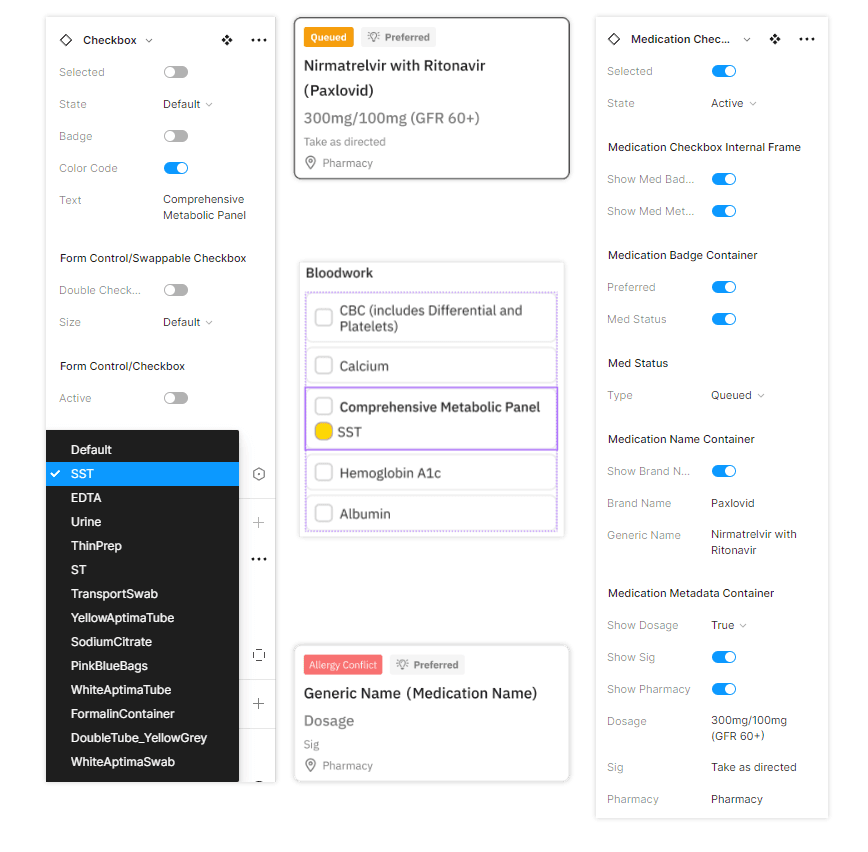
Custom design system
I provided NLUC with a custom design system complete with components that were tailor built to the context of the app. This system provided a coherent set of UI elements, including buttons, input fields, and navigation menus, all designed to meet the unique requirements of NLUC's clinical workflows.
A benefit of this system is that it allows NLUC's internal teams to drag and drop components and quickly edit those components using the design panel for quick mockups after I've handed off the project.
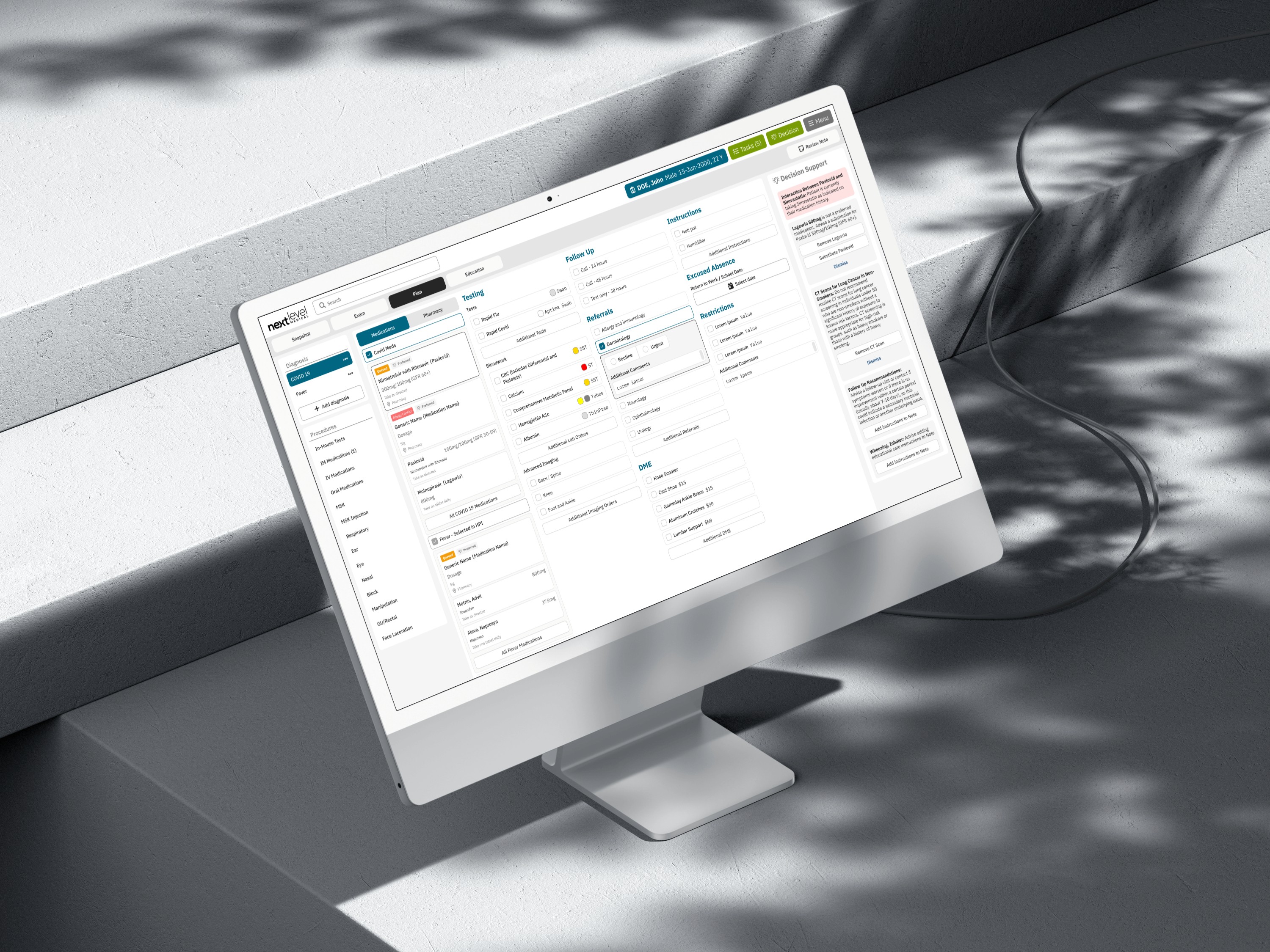
Plan screen, shown on a desktop device

A real-world impact
My clinical note builder is now live across the Next Level clinic network
© Sam Bajwa 2024